![logo_2018_rgb_on-white.png]](https://support.pixeld.com.au/hs-fs/hubfs/logo_2018_rgb_on-white.png?height=40&name=logo_2018_rgb_on-white.png)
Images are crucial for any website as they help to break up text, add visual interest, and improve the overall user experience. However, choosing the right size for your images can be a tricky task as there are many factors to consider, such as the layout, the device being used, and the purpose of the image. In this article, we will look at the standard sizes for images and different ways to resize them to fit your layout.
By the end of this article, you will have a better understanding of how to choose the right image sizes to ensure that they look great on your website and enhance the user experience.
Let's get started!
Icon Images
Icon images are small graphics used to represent an action or idea. These images are usually used in navigation menus, buttons, and links, and should be kept at a small size to avoid taking up too much space on the page size for icon images is between 16x16 and 32x32 pixels. However, this may vary depending on the area and design of your website the icon is being used. For example the icon-cards/icon-grid component takes much larger icons (around 150x150 pixels) allowing for more detail.
It's important to ensure that icon images are clear and easy to understand, as they are often used to guide users through your website. Make sure to use simple graphics and avoid using too much detail, as this can make the image difficult to read.
Additionally, it's a good idea to use the same icon style throughout your website to maintain consistency and make it easier for users to navigate.
Thumbnail Images
Thumbnail images are small versions of larger images, and are often used in galleries, image sliders, and blog posts. The recommended size for thumbnail images is between 150x150 and 300x300 pixels. However, this may vary depending on the layout and design of your website.
When using thumbnail images, it's important to ensure that they are clear and easy to see. Avoid using images that are too small or too large, as this can affect the overall user experience. Additionally, make sure that the images are high-quality and relevant to the content they are associated with.
Thumbnail images are a great way to showcase your content and encourage users to click through to view the full-size image or read the full article.
Split-Content Images
Split-content images are images that are split into two or more sections, with text or other content in between. These images are often used in headers, banners, and feature sections, and should be kept at a size that fits well with the layout of your website.
The recommended size for split-content images varies depending on the design of your website and the purpose of the image. However, a good starting point is between 800x400 and 1200x600 pixels. This size allows the image to be split into two or three sections, while still maintaining a high level of detail.
When using split-content images, it's important to ensure that the text or other content in between the images is easy to read and doesn't detract from the overall design. Additionally, make sure that the images are high-quality and relevant to the content they are associated with.
Hero Images
Hero images are large, full-width images that are used to create a visual impact and set the tone for your website. These images are often used on the homepage or landing pages, and should be chosen carefully to ensure that they represent your brand and message.
The recommended size for hero images varies depending on the layout of your website and the device being used. However, a good starting point is between 1920x1080 and 2560x1440 pixels. This size allows the image to be full-width on most devices and ensures that it looks great on high-resolution screens.
When choosing a hero image, it's important to ensure that it represents your brand and message. Additionally, make sure that the image is high-quality and relevant to the content it is associated with. Finally, consider using a call-to-action or other text overlay to encourage users to take action.
Resizing Images
Now that we have looked at the standard sizes for images, let's talk about resizing images to fit your layout. There are several ways to resize images, with useful inbuilt system tools on both Windows and Mac.
Using Windows:
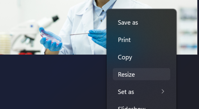
The windows preview tool "Photos" now has an inbuilt resizing tool making resizing directly in windows a breeze!- Open the image in Photos
- Right click the image and click resize.
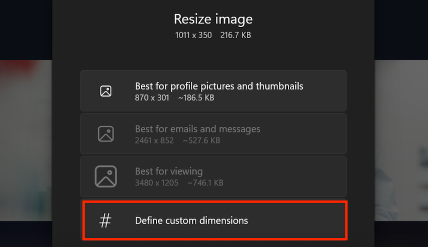
- From this panel click define custom dimensions.
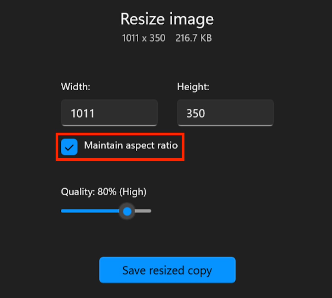
- With maintain aspect-ratio checked resize the image to the desired size and click "Save resized copy". This method will allow you to save a copy of the file in addition to the original.
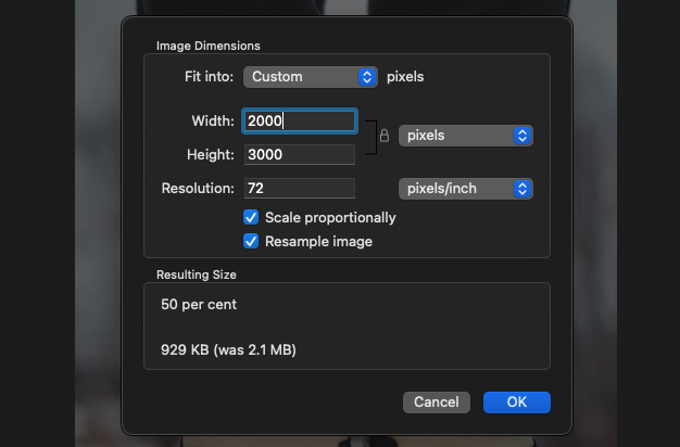
Using Mac:
Like the example above the default Mac "preview" app has resizing tools inbuilt for quick and easy resizing. However unlike above this method directly overwrites the file (so save a copy beforehand if you which to retain the original!)
- Open the image using Preview.
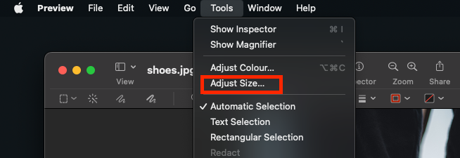
- From the top toolbar select Tools>Adjust Size
- With "Scale Proportionally" selected adjust the image to the desired size and click OK.
Using Online Tools to Resize Images
There are also online tools available that can help you optimise and resize images for the web, https://imageresizer.com/ is one such tool (and it's completely free!).